Top Ten
This data visualization application studies the question, if a teams value effects their performance? Does wealth necessarily result in wins? Through this app the user can view the history of the NBA's top 10 teams from the past 5 years, and see how their value impacts their overall seasons winnings.

The Problem
Being a sports fan, I have always wondered if the value or wealth of a team effects their talent and ability to win. Typically the more valuable a sports team, the more talented the players are which should produce more wins. However, I questioned that.
Do the more valuable teams actually win more often than the lesser value teams?
By studying the Forbes “Worlds Most Valuable Teams 2015“ article and the history of a teams winning/losing patterns, I compared the value of a team to it’s percentage of wins for their last completed regular season for the NBA.
Personas

Use Cases
Zander is a commuter. He lives in Hoboken, and works in Manhattan. Everyday he takes a water taxi and a train, so his commute is about 40+ minutes. During his commute he enjoys catching up on news and fun articles. As Zander starts his commute he sees a push notification from Top Ten, and immediately opens the application to check out the new study. He thinks it is so interesting to see how sports change over time, and cannot wait to school his buddies later at softball with this new knowledge.
Katie finally has a free night! Typically she works late, but not tonight, she has plans with her girl friends to meet up for cocktails. Katie was actually so excited to go out tonight, she was ready quicker than she planned. To kill some time before she needs to leave, she grabs her iPad and opens the Top Ten app her bother recently downloaded for her to check out. Katie has an inquisitive nature, so she really enjoys the topics Top Ten offers, and the perspective it takes. Before she knew it, it was time to go, but before leaving she turned on the Top Ten push notifications to make sure she doesn’t miss a new study.
The Objective
To create a data visualization application that clearly defines the differences between the value of a team and their winning statistics in order to answer the question, do more valuable teams actually win more often than lesser value teams?

The Core Features & Functions
1) To compare and contrast the value of a team and their winning % per season
2) To visually present the information and visualize the data
3) To show through data visualization that the most vaulable team doesn’t always perform the best
4) To entertain the user
Research/Statistics

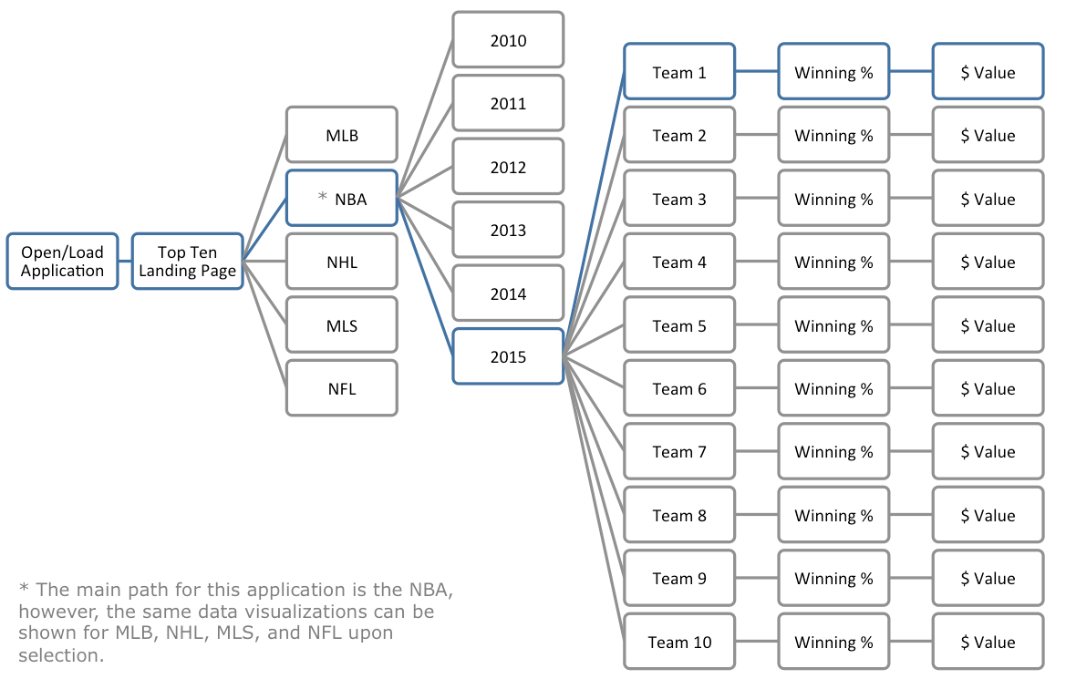
Content Flow Overview
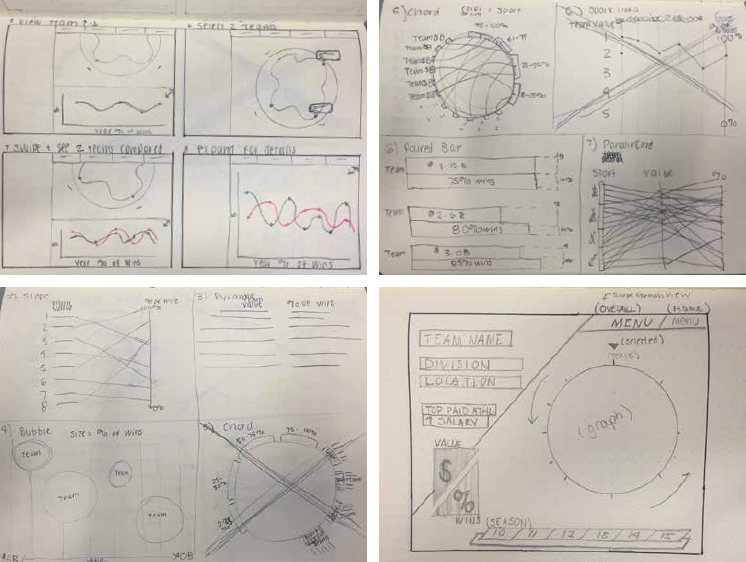
Preliminary Sketches
LoFi Main Wireframe

Style Board

Mood Board

Visual Designs

This is the loading page the user will see when the application is opened.

By default the screen will show the highest valued team first, and that teams % of wins and extra details.

The user can toggle between each team. The color of the line changes to green if the team has a positive or negative outcome.
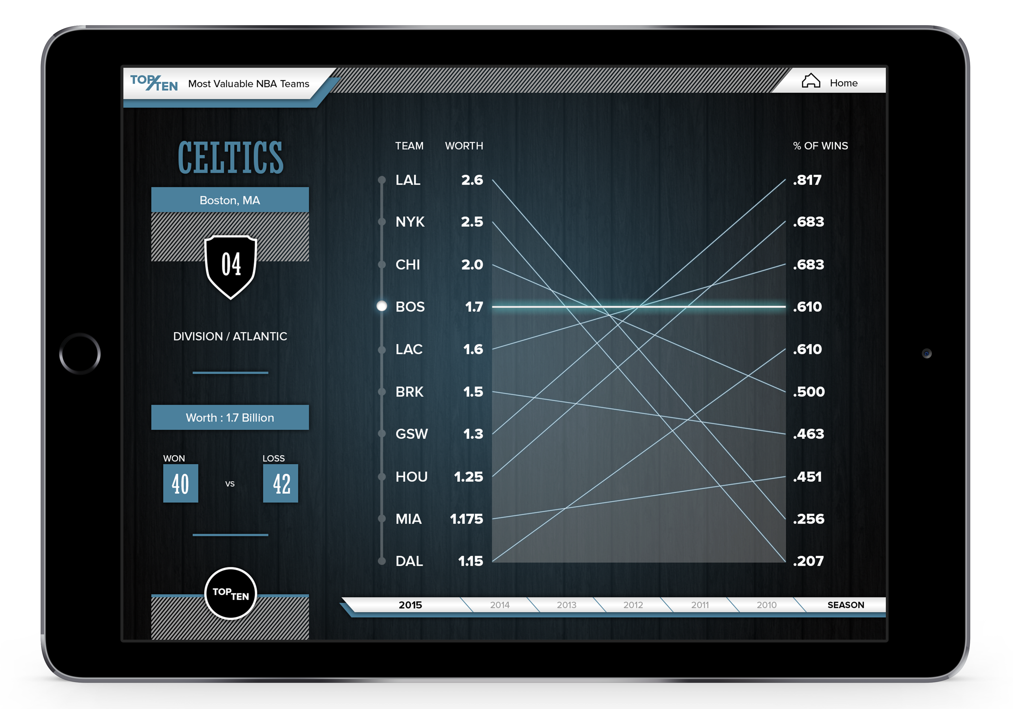
If a team is directly even, their line will appear blue.
Visual Design Prototype